Color is a conundrum. On one hand, it’s so familiar we almost don’t notice it. We’ve been using color for millennia, from simple daubs on primitive pottery to the most sophisticated modern works of art, architecture, fashion and — of course — craft.
On the other hand, the entire topic of color seems highly mysterious. Where does it come from? How do we create palettes and apply them to our own work? And perhaps the biggest question mark of all, especially for those of us in craft-oriented businesses: How can we forecast which colors will be trending well into the future?
Let’s define these terms first.
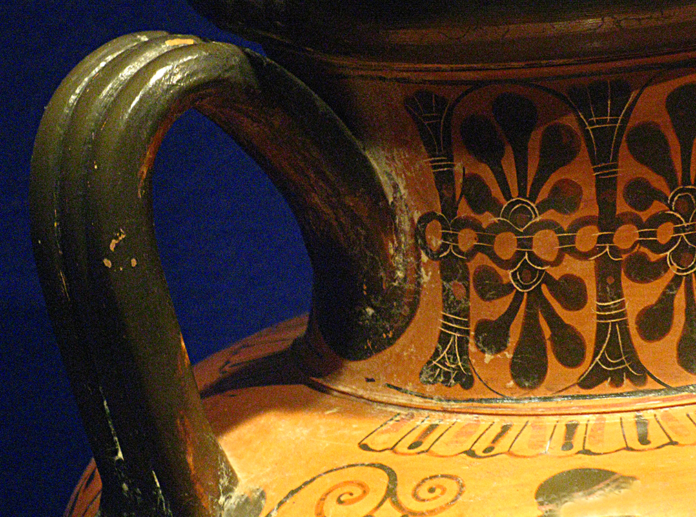
Even with limited color resources, an ancient Greek artist managed to transform a utilitarian vessel into an objet d’art. Was that deep ochre perhaps the Color of the Year c. 400 BCE?
Photo courtesy of Lindy Thibodaux. Photo taken at the Portland Art Museum, Portland, Oregon.
Forecasting
What is a forecast, anyway? Put simply a forecast is a prediction about how something (such as the weather) will develop.
When I was taking the oral part of the exam to get my pilot’s license, the examiner asked me, “What’s the single most accurate way to get weather information?” My answer: “Look out the window.” I wasn’t being facetious — the truth is, you can take all the data from all the fancy equipment, and it still may tell you it’s raining when it’s actually not. So with color trend forecasting, what’s the equivalent of looking out the window?
Trends
What are trends? Trends happen in response to many influences, from politics to popular culture. The key word here is response; trends are reflective of what’s already happening, not of what may happen in the future. So if we’re following trends, we are by definition followers. And that’s simply not good for business — especially a creative business.
There’s a big difference between trend-spotting and trend-setting. My feeling is, if you’re spotting a trend, it’s already happening. When I was running my yarn shop, I had to make decisions about my merchandise at least six months ahead of when it would actually be available to my customers. If I’d been following trends, my merchandise would have arrived too late. In the craft world, we need to be setting the trends instead of spotting them.
Ah, but how do we do that?
Question: Why did you get into the craft business you’re in? Isn’t it because you have something unique to say, and you want to be able to express that in your own way? But if that’s the case, how does it help you to let someone else forecast what’s best for your business? Why not forecast for yourself?
The color-forecasting equivalent of looking out the window is looking at your own work to identify current trends, which help point you in a new direction for the future.
Spot trends in your work. If possible, look at a wide range, either of your own projects or merchandise in your shop — or both. The patterns you identify are your current trends.
Since I believe it’s imperative to always have something new to show our customers, I might well decide to focus more on developing softer colorways, maybe even (gasp!) neutrals like desert-inspired hues. Oh, guess what? Pantone’s Colors of the Year are Pink Quartz (a pale, warm pink) and Serenity (a cool periwinkle blue) — both soft colors.
Frankly, I’m not particularly attracted to Pink Quartz and Serenity as a pair, although I do like each individually; each could be incorporated into its own color palette, which I would find easier to use. I think it’s unwise to force myself to use colors I don’t personally care for. Color should inspire us, not make us feel like we have to use it because someone said so.
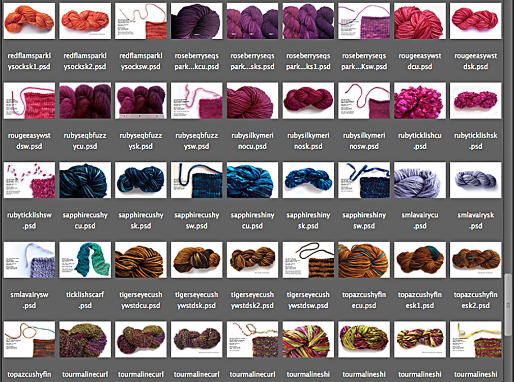
In this screen shot of a folder of my hand-dyed yarns, I can see some things that are pretty consistent (i.e. trends): saturated color, tonal ranges and varied textures. What does that tell me about my future work?
Now, using the trends you’ve found in your work, consider what might come next. Remember that color trends are cyclical, although that doesn’t necessarily mean they’ll repeat in their original form. For example, the bright, happy turquoise and red combination that’s so evocative of the 1950s has recently resurfaced in a moodier, deeply saturated version. It just so happens it’s one of my own favorites, so I created this color sequence for one of my Scraplet Skeins:
My own color forecast for 2016
Some of you may want someone to simply tell you what colors are on trend so you can get on with your work. Even though I’m a color specialist, I can’t do that and here’s why: I’m not you. (What if I tell you to use jewel tones, but your work calls for dusty neutrals?)
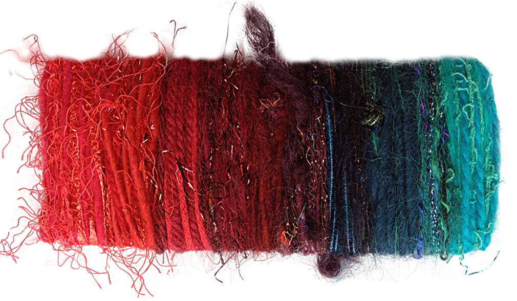
This color card for my Caribbean Christmas colorway shows how I started with the red and teal at each end, then graduated the colors to blend them into the final sequence. (Each Scraplet Skein has 10 color sections.)
Photo by Lindy Thibodaux
But I can tell you about my process, and show you the colors I’m thinking about for summer and fall. I start by simply noticing what I’m attracted to at the moment, compare that with what I’ve offered (and what sold best) in the most recent seasons as well as in seasons past. For example, if I’ve done really well in the last year with shades of teal, I’ll still offer teal, but perhaps in a different saturation or combined with new accent colors, like the Caribbean Christmas colorway shown above. Again, show your customers something new, or, put another way, show them the same thing … only different.
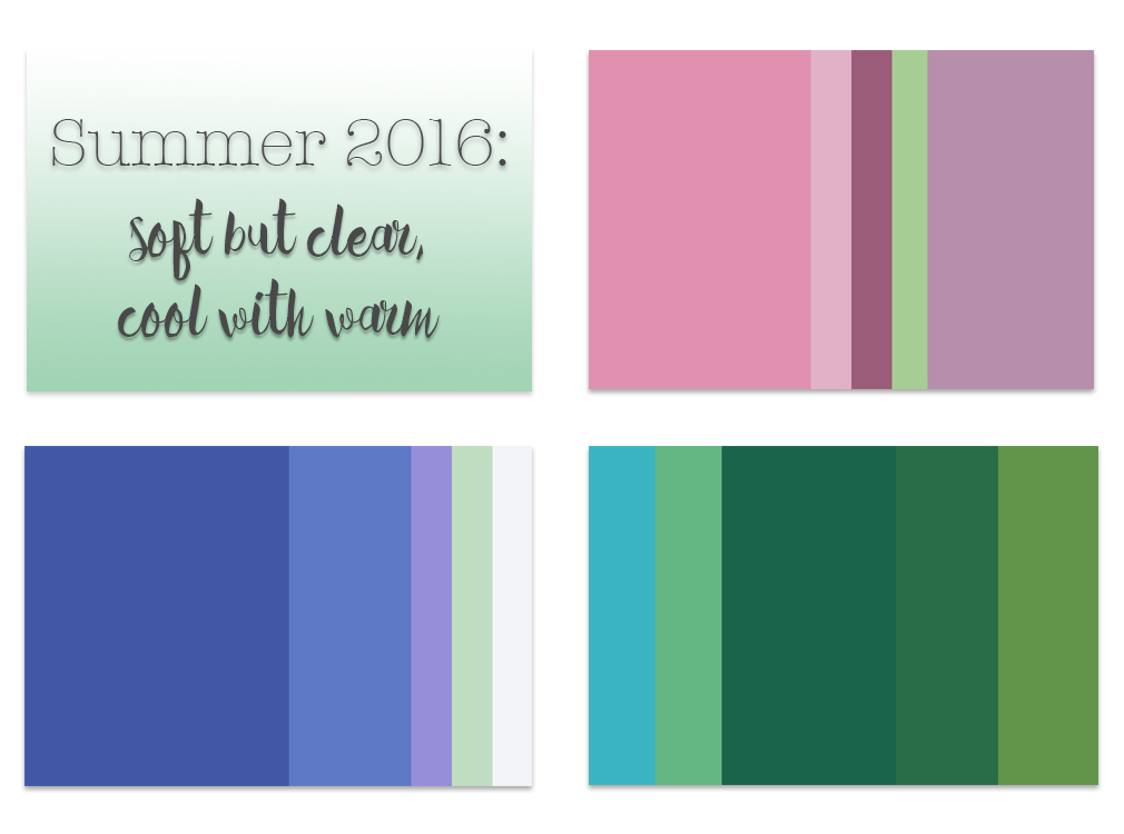
3 of my palette picks for Summer 2016. Note that they’re all based on ranges of 1 main tone, but with a single accent color. Also, the dark grey I used for the text is the perfect neutral tone to pair with these softly colorful palettes. Palettes are from my own collection at Colormusing.com.
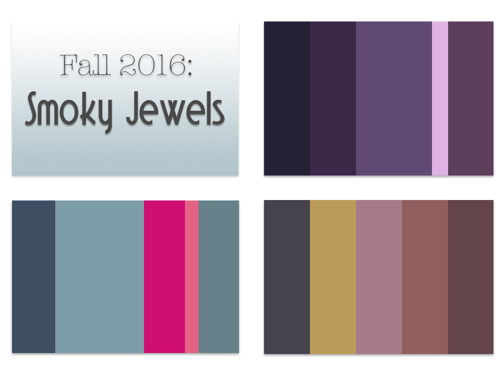
Three of my palette picks for Fall 2016. In addition to the deep grey, these hues have grey in them, toning down the saturation and adding a smoky quality. Palettes like these really benefit from the occasional jolt of a super-saturated accent, like bright lavender, fuchsia and gold. Palettes are from my own collection at Colormusing.com.
So what am I predicting for the rest of 2016? Well, for going into summer, I like colors that are simultaneously soft and clear. (I gravitate toward colors that are not quite definable.)
For fall, I’m loving deep, silvery greys — they provide just the right neutral ground for my favorite fall colors, which I’m calling the Smoky Jewels.
Color may be a conundrum, but color forecasting is very nearly an oxymoron. Color itself doesn’t change; how we use it does. And how you use color individually in your own work determines the color trends of the craft industry collectively. Create! That’s what makes you a trendsetter.
Lindy Thibodaux
contributor

Great article Lindy! I just got back from Quilt Market in SLC and saw many of the colors you are predicting for 2016 in the fabric booths. The one fabric designer I think captured your prediction the best is Kathy Doughty of Material Obsession. Her new line with FreeSpirit uses the softer colors that combine both the summer and fall colors you show above.
One way I research color and design trends are to look at the fashion magazines. I find that the fashion industry is about 2-3 years ahead of the craft industry.
Kathy Miller has done several school houses about color trends and I remember her saying that she looks to plastics for color forecasting. She said manufacturers of containers and bowls are usually ahead of the game. Interesting!
That’s so interesting – I just bought a set of nesting bowls purely because the colours were so pretty together. I think I’ll use those colours to make a quilt now so I’ll be ready for the trend next year!
Kirsty, I SO (sew?) relate— I’ve been known to buy things for the exact same reason, and can’t remember a single one that I’ve regretted. It’s always worthwhile surrounding ourselves with inspiring colors, right? And I can see your Instagram now— your beautiful new quilt artistically arranged around your set of bowls… : )
So interesting, Kristin! I had a list of my own favorite forecasting resources that didn’t make it into this article, but which included hgtv.com— I also find that home decor seems to be on the forefront of color trends. I’ll start looking more closely at plastics!
Thank you, Amy! I’ll have to take a look at the fabric collection you mention— I’m always inspired by quilting. I’ve been sewing garments since I was a little girl, but have yet to delve into quilting (never say never). Hmm, wonder if I could translate my palettes into quilt blocks?